ICWRER 2025 Conference Website – A Modern React Experience for Academic Excellence


Built a comprehensive conference website that brings together water resources researchers from around the globe, featuring dynamic animations, responsive design, and seamless user experience for academic excellence.
🔗 Live Project
🔗 Conference Website: https://karunya.edu/daiml/icwrer
🪄 What Sparked This Project?
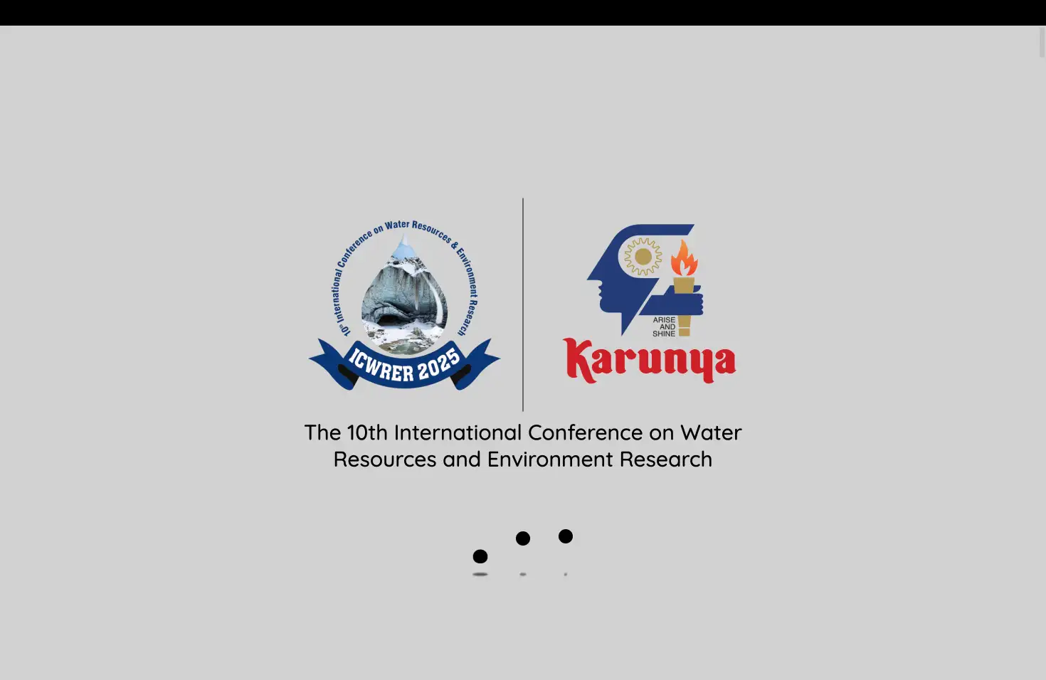
The International Conference on Water Resources and Environment Research (ICWRER) 2025 needed a digital presence that matched its academic prestige. As a developer passionate about creating meaningful web experiences, I was commissioned to build a sophisticated conference website that would serve hundreds of researchers, students, and industry professionals worldwide.
The challenge was clear: create a website that not only looks stunning but also handles complex conference logistics – from registration and accommodation booking to detailed schedule management and committee information. The site needed to be professional yet approachable, informative yet engaging.
What excited me most was the opportunity to combine my technical skills with environmental consciousness, creating a platform that would facilitate important discussions about water resources and climate change. The conference organizers wanted something that would stand out from typical academic websites while maintaining the credibility and professionalism expected in academic circles.
🧰 Tech Stack
Frontend Framework & Build Tools:
React 18.3.1 - Modern hooks and functional components for component-based architecture
Vite - Lightning-fast development server and optimized builds for superior performance
JavaScript ES6+ - Modern JavaScript features for clean, maintainable code
Styling & Design:
Pure CSS - Complete control over styling with CSS custom properties for theming
CSS Custom Properties - Centralized theming system for consistent design
Custom CSS Animations - Smooth transitions and loading effects for enhanced user experience
Responsive Design - Mobile-first approach ensuring perfect experience across all devices
Media & Typography:
Font Awesome 6.7.1 - Consistent iconography throughout the interface
Google Fonts - Custom typography with Quicksand, Outfit, and Josefin Sans
HTML5 Video - Optimized background video playback with cross-browser compatibility
Development & Deployment:
Vercel - Instant deployments with global CDN for optimal performance
Git - Version control with organized commit history
I chose React for its component-based architecture, which was perfect for managing multiple complex sections like registration tables, committee listings, and accommodation details. Vite was selected over Create React App for its superior build performance and modern development experience.
The decision to use vanilla CSS instead of a framework like Tailwind was intentional – it gave me complete control over the visual design and allowed for custom animations that truly reflect the conference's professional branding. This approach enabled me to create unique loading animations and transitions that perfectly match the academic context.
✨ Key Features
User Experience & Interface:
🎬 Cinematic Loading Experience - Custom loader with animated logos and smooth transitions that builds anticipation before revealing the main content
🧭 Dynamic Navigation System - Intelligent navbar that highlights active sections based on scroll position, with dropdown menus for complex conference structure
🎥 Video Background Hero - Engaging background video with overlay effects that immediately communicates the conference's environmental focus
📱 Responsive Design - Flawless experience across all devices with optimized mobile interactions
Conference Management Features:
💳 Registration System - Interactive tables showing early bird vs. regular pricing for both domestic and international participants
👥 Committee Management - Organized display of steering committee, national advisory committee, and local organizing committee with individual profiles
📅 Interactive Schedule - Swipeable schedule table with clear day-by-day breakdown of conference activities
🏨 Accommodation Integration - Seamless booking system with detailed venue information and pricing
Technical Excellence:
⚡ Performance Optimized - Lazy loading for images, optimized video handling, and efficient component rendering
🎨 Custom Animations - Smooth transitions and loading effects that enhance user experience without distraction
♿ Accessibility - Proper semantic HTML, keyboard navigation support, and screen reader compatibility
📊 Scroll-Based Navigation - Real-time navigation highlighting based on viewport positioning
🚧 Challenges I Faced
Video Loading and Performance Optimization
The hero section features a background video that needed to load seamlessly
without blocking the user experience. I implemented a sophisticated loading
system that waits for video readiness before transitioning from the loader,
ensuring smooth playback across all devices and connection speeds. This
involved careful handling of video preload attributes,
muted playback for autoplay compatibility, and
playsInline for mobile optimization.
Complex State Management with Scroll Navigation
Managing active navigation states based on scroll position proved tricky. I created a custom scroll listener that calculates viewport positioning and updates navigation highlights in real-time, including handling dropdown menu states for nested navigation items. The challenge was ensuring smooth performance while constantly monitoring scroll events without causing performance bottlenecks.
Responsive Table Design for Complex Data
The registration and schedule tables needed to work flawlessly on mobile devices while displaying complex information. I solved this by implementing horizontal scroll containers with visual cues (like the "Swipe" button) to guide users on mobile interactions. The tables maintain their structure while providing clear navigation hints for mobile users.
Multi-Component Architecture Management
With 15+ major components, maintaining consistent styling and state
management became complex. I established a clear CSS variable system in Variables.css and component communication patterns that kept the codebase maintainable. This
included organizing components logically and ensuring consistent prop passing
patterns throughout the application.
📚 What I Learned
Advanced CSS Animations - Mastered complex loading animations, smooth transitions, and custom hover effects that enhance user experience without being distracting
Performance Optimization - Learned to optimize video loading, implement lazy loading for images, and manage component re-renders effectively for smooth user experience
Accessibility Considerations - Implemented proper semantic HTML, keyboard navigation support, and screen reader compatibility throughout the site
Project Structure - Developed a scalable folder organization system that separates components, utilities, and styling logically for maintainability
Client Communication - Enhanced ability to translate academic requirements into technical specifications and user-friendly interfaces
📈 Optimisations & Performance
Image and Video Optimization
All images use the loading="lazy" attribute to
improve initial page load times. Background video includes multiple optimization
techniques: preload="auto", muted, and playsInline for better mobile compatibility.
This ensures fast loading while maintaining visual impact.
Component Architecture Optimization
Each section is a separate component, enabling better code organization and potential for future code-splitting. This modular approach makes the codebase more maintainable and allows for efficient updates to individual sections without affecting the entire application.
CSS Custom Properties System
Centralized theming system in Variables.css for
consistent design and easy maintenance. This approach eliminates repeated style
definitions and makes theme modifications effortless, while ensuring design consistency
across all components.
Smooth Scrolling Implementation
Custom scroll behavior with offset calculations ensures perfect navigation positioning. The scroll listener is optimized to prevent performance issues while providing real-time navigation updates and smooth transitions between sections.
🙌 Final Thoughts
Building the ICWRER 2025 conference website was an incredibly rewarding experience that challenged me to create something truly professional and functional. The project taught me the importance of balancing visual appeal with practical functionality – every animation and interaction serves a purpose in guiding users through the conference information.
My biggest win was creating a loading experience that actually enhances the user journey rather than frustrating users. The seamless transition from loader to hero video creates a memorable first impression that sets the tone for the entire conference experience. The scroll-based navigation system also became a standout feature that provides intuitive wayfinding throughout the complex conference information.
If I were to start over, I might consider implementing a content management system for easier updates to committee information and schedule changes. I'd also explore adding a registration form integration with payment processing and automated email confirmations. Additionally, implementing a dark mode theme could enhance accessibility for different user preferences.
The water resources and environmental focus of this conference made the work feel meaningful beyond just the technical aspects. It's rewarding to know that this website will help facilitate important discussions about climate change and water conservation that could impact our planet's future. This project proved that academic websites don't have to be mundane – they can be both informative and visually engaging while maintaining the credibility expected in professional academic contexts.